
Graphs with no time line – why and how
| 7-8-2017 | Lionel Pavey |
A key role within the Treasury function is providing forecasts to the directors and management. Graphs are a frequently used tool of course.
When constructing graphs it is normal to put time on the horizontal x axis and read the prices from left to right – from old to new. Visually, this appeals to us as we normally read from left to right. However, when the price does not change much for a long period of time the graph no longer looks fluid – there is a period of activity, followed by a long period of almost standing still, followed by another period of activity. To try and eliminate this period of inactivity whilst still presenting the data requires an approach where sequential time is removed from the equation. This brings us to the last article in this series.
The following two graphs ignore time and focus purely on changes in the price that have been filtered to meet specific criteria.
Renko Charts
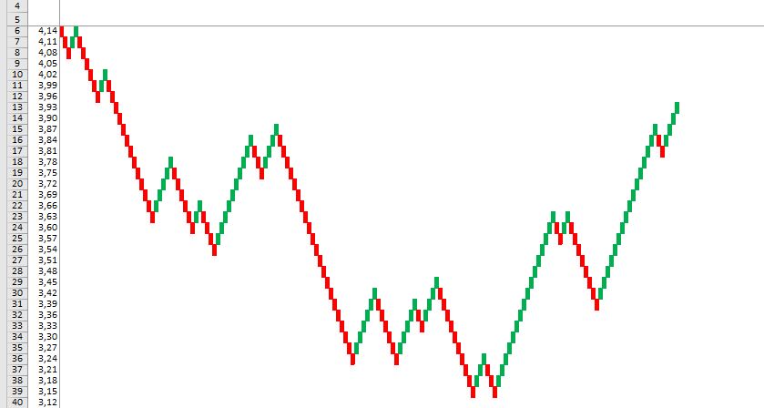
Prices are represented by blocks – hollow for upward movements and solid for price falls.
Every block has a predefined value – if we were showing interest rates a block could represent 5 basis points. If we had an upward price movement this means that the following upward block can only been drawn once prices have risen more than 5 basis points from the last block. If the price moved up 4 basis points and then dropped by 3 basis points, no additional blocks would be added to the graph.
Blocks are plotted at a 45 degree angle showing upward and downward sloping price changes.
Price reversals are shown when prices have moved more than 2 blocks in the opposite direction. Yet again if we had an upward slope and the price was 1.25 (our blocks are set to 0.05 or 5 basis points) we would require a downward movement of more than 0.15 (15 basis points) to 1.10 to draw 2 solid blocks downwards.
What remains is a very smooth representation of price movements with a uniform value for every block, whilst filtering out smaller movements that have been filtered out by the conditions set on block size.
Point and Figure Charts
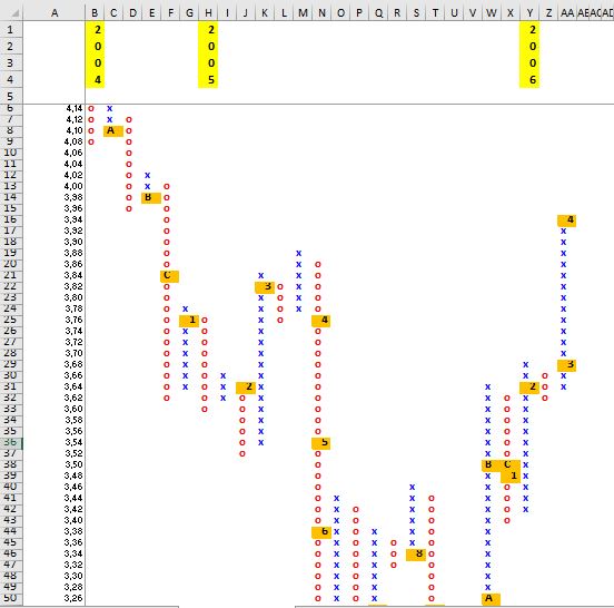
Price changes are represented by vertical columns – X’s for rising prices and O’s for falling prices.
As with Renko charts, the X’s and O’s have a predetermined size and a price reversal is shown when prices change by 3 boxes as opposed to 2 on a normal Renko chart. When direction changes a new column is drawn to the right of the present column. Otherwise, the same criteria is applied to both charts except point and figure show true vertical columns as opposed to 45 degree lines.
So why would someone look at prices in this particular way? Such a chart does not necessarily show the latest price – the predefined filters ensure that only price changes that meet the criteria are shown.
The main advantages include:
- A constant filter that reduces the noise associated with normal time charts
- Analysis is based only on movement – not on time
- Perceived support and resistance levels are easier to see
- The current trend is very clear to see
All the techniques shown in this series are applicable to everyday analysis and everyone has their favourite approach. Some like to see all data, whilst others prefer to see filtered, smoother data. The eternal question when looking at charts and seeing the current trend is to ask “where will the price go?” Initially, the immediate answer is that price will follow the current trend until such time as it does not anymore. This might seem a cheap flippant answer, but it is the truth. We have firmly established that we need to know the price in the past to determine if the present price movement is in a clearly established trend. If we knew nothing about the price in the past it would be pure guesswork to say which way the price would go?
We could still be wrong however, but at least we can establish why and how we made our opinion.
No chart or charting system can clearly determine what the future price will be with 100 per cent accuracy. By following the trend we can at least say what the current market direction is, without being able to clarify, purely on price, when the market will change direction.
Charts that eliminate time make it easier to see where the top and bottom of the market prices have been established. Therefore, if we are in an upward trend and approaching a market high that has been reached twice before, we can state with a reasonable amount of confidence that we are approaching a level that the market has tested twice before but not been able to break above. This would imply, on a technical analysis, that there is perceived resistance in the market to taking the price above the previous high.
However, a word of caution when using charts.
The best analogy I have ever heard for not relying 100 per cent on charts is as follows:
Would you sit behind the steering wheel of a vehicle and drive forward whilst the windscreen was blacked out and only have the rear view mirror to show you where you have been and only have that information to decide when you had to steer?
There is no system that can guarantee telling you what the future price will be. Analysis has to be taken with a pinch of salt but, any market professional should be able to perform analysis. If you can not analyse then you can not predict.

Cash Management and Treasury Specialist
You might have missed the first two articles of this series and can find them here: